Fresenius Medical Care
Simplifying Fresenius’ digital landscape to make renal care easier for patients & doctors

Role
Lead Designer (from conception, to execution, to delivery)
Challenge
Despite being one of the leading renal care and dialysis machine providers, the Fresenius Medical Care North America (FMCNA) website was a clunky and unintuitive experience. With nearly 30 different sub-brands under the Fresenius umbrella (yes, you read that right), users were being presented with a disjointed and outdated representation of the brand.
Solution
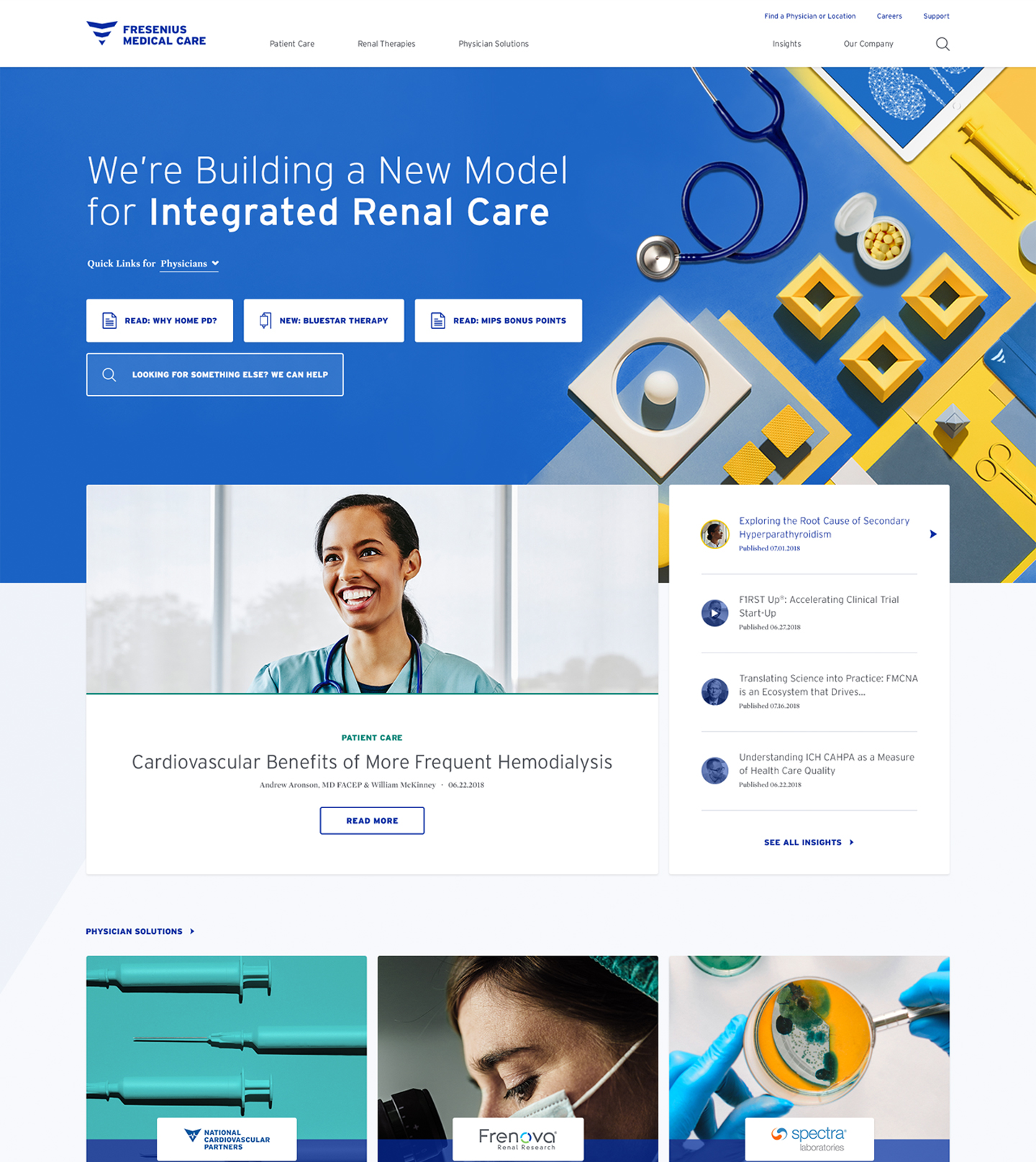
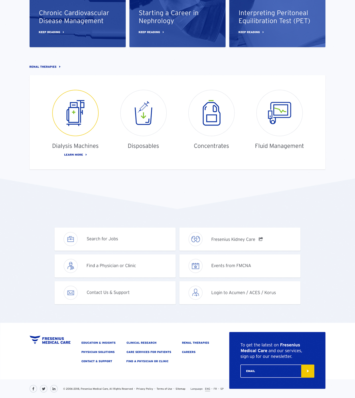
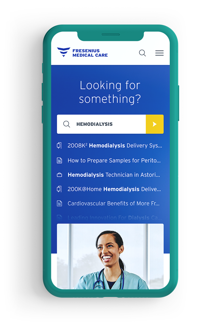
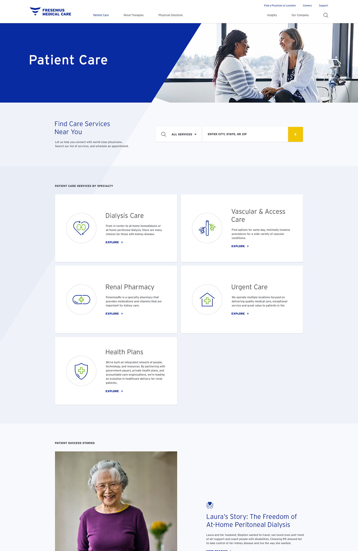
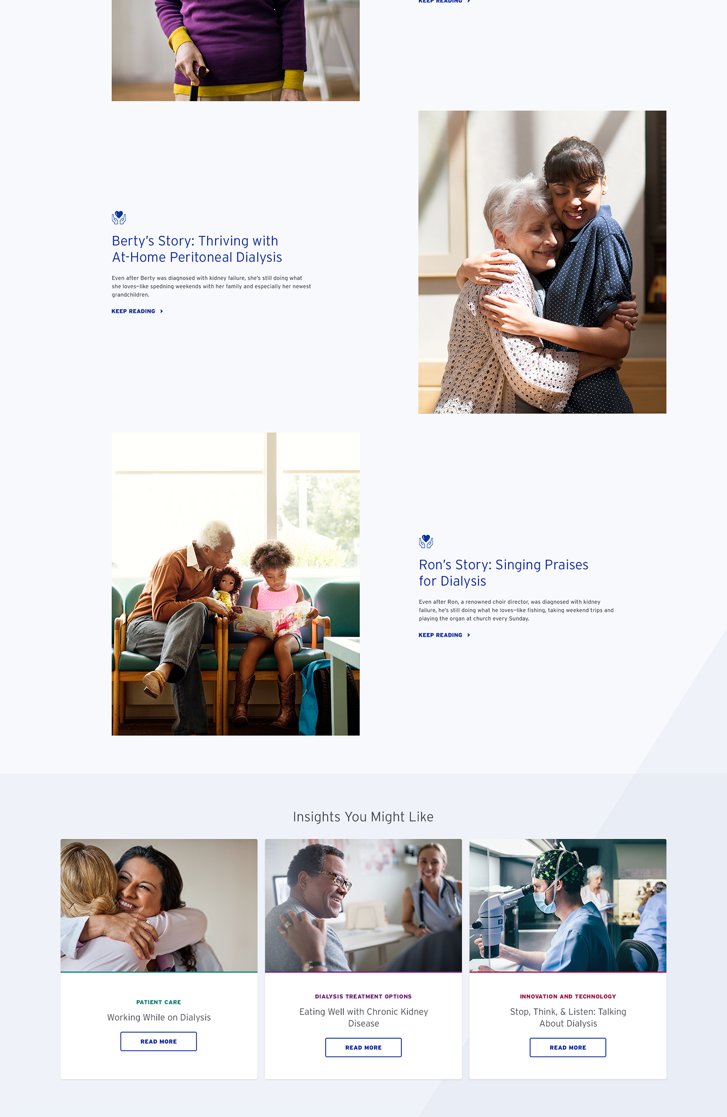
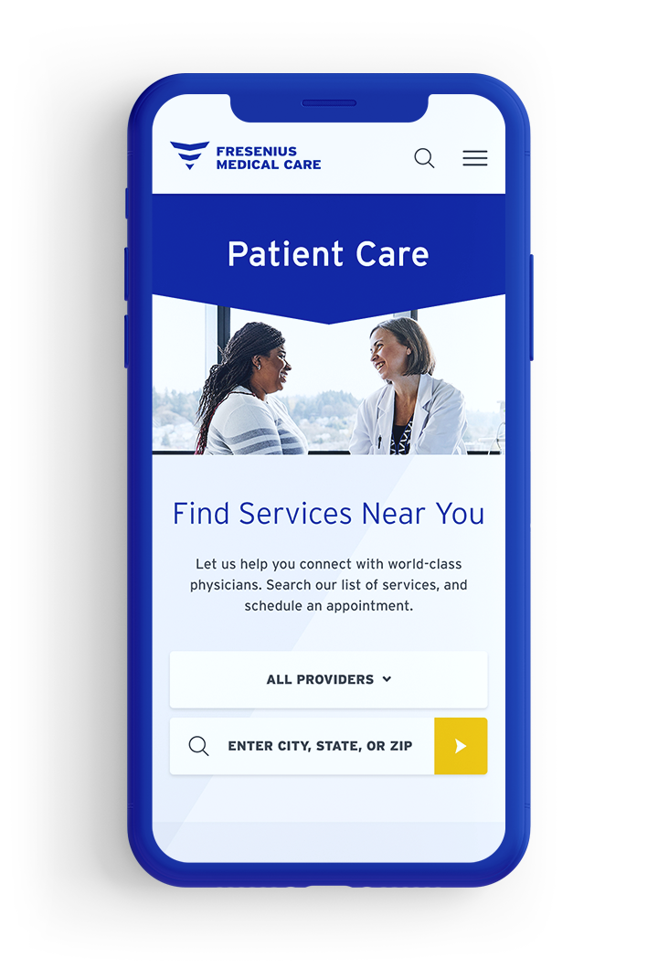
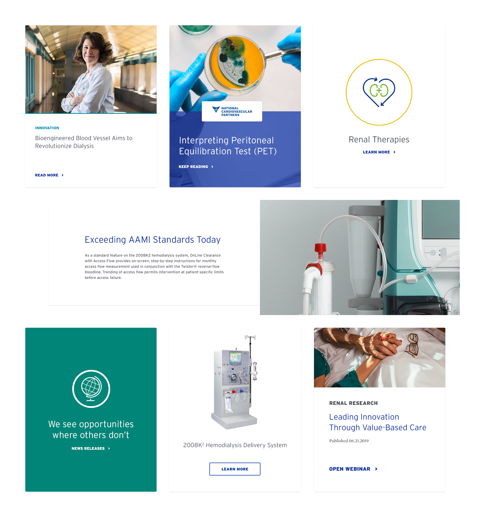
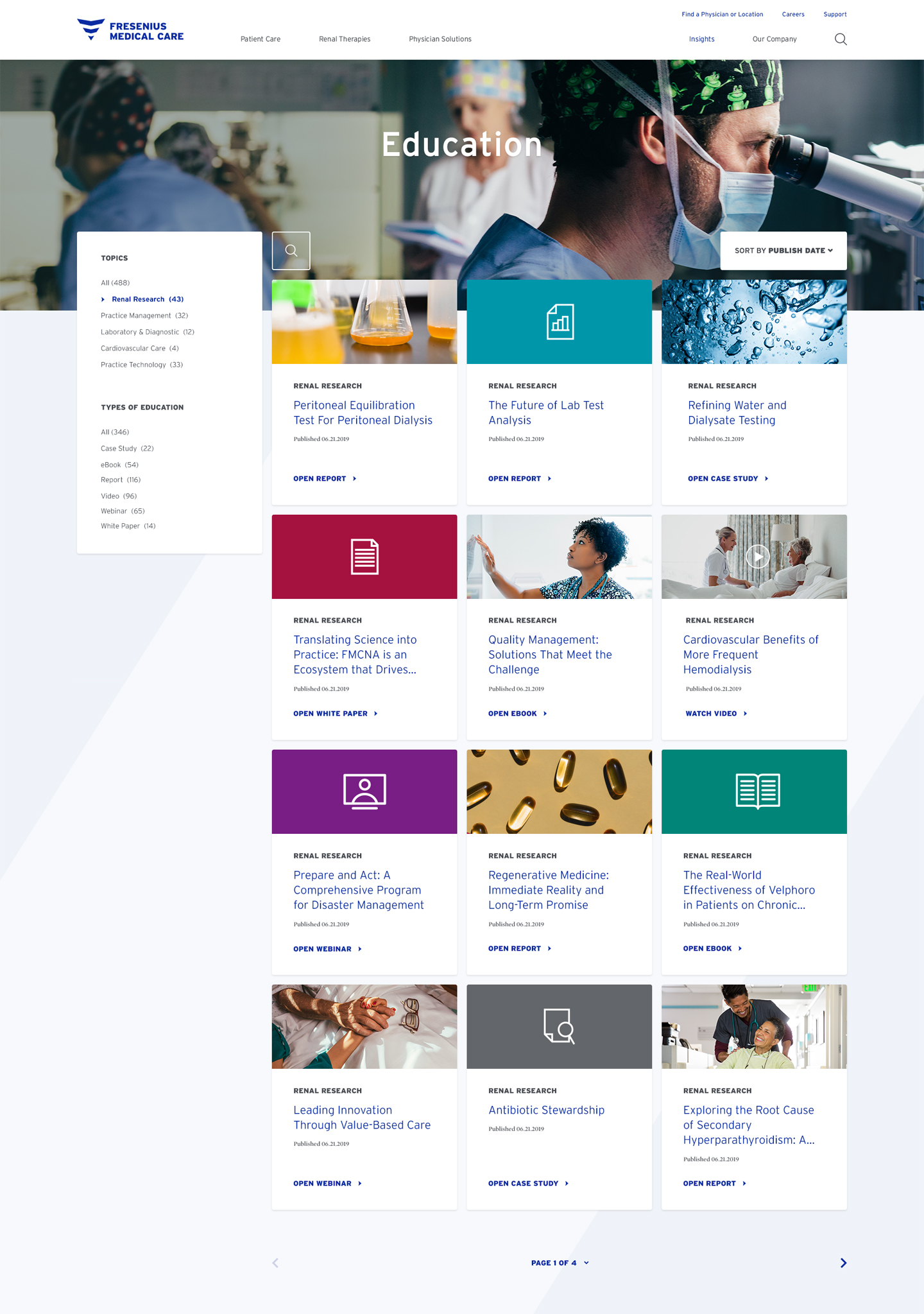
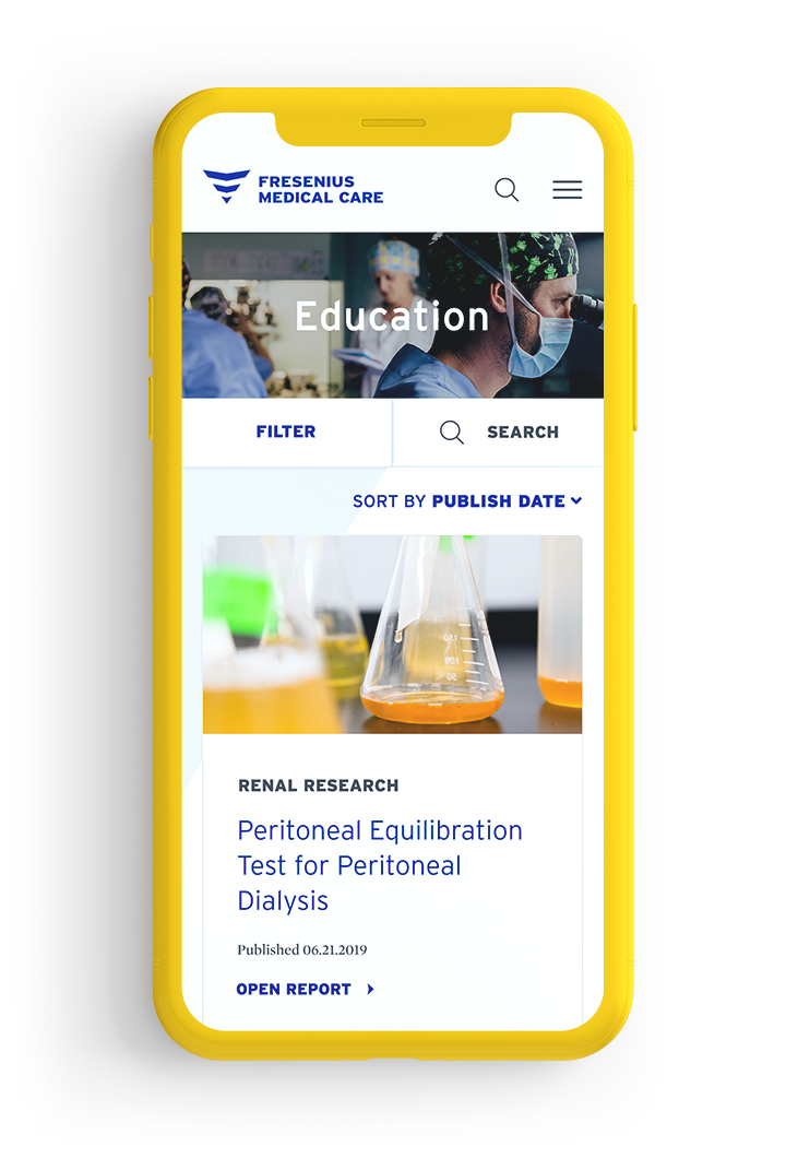
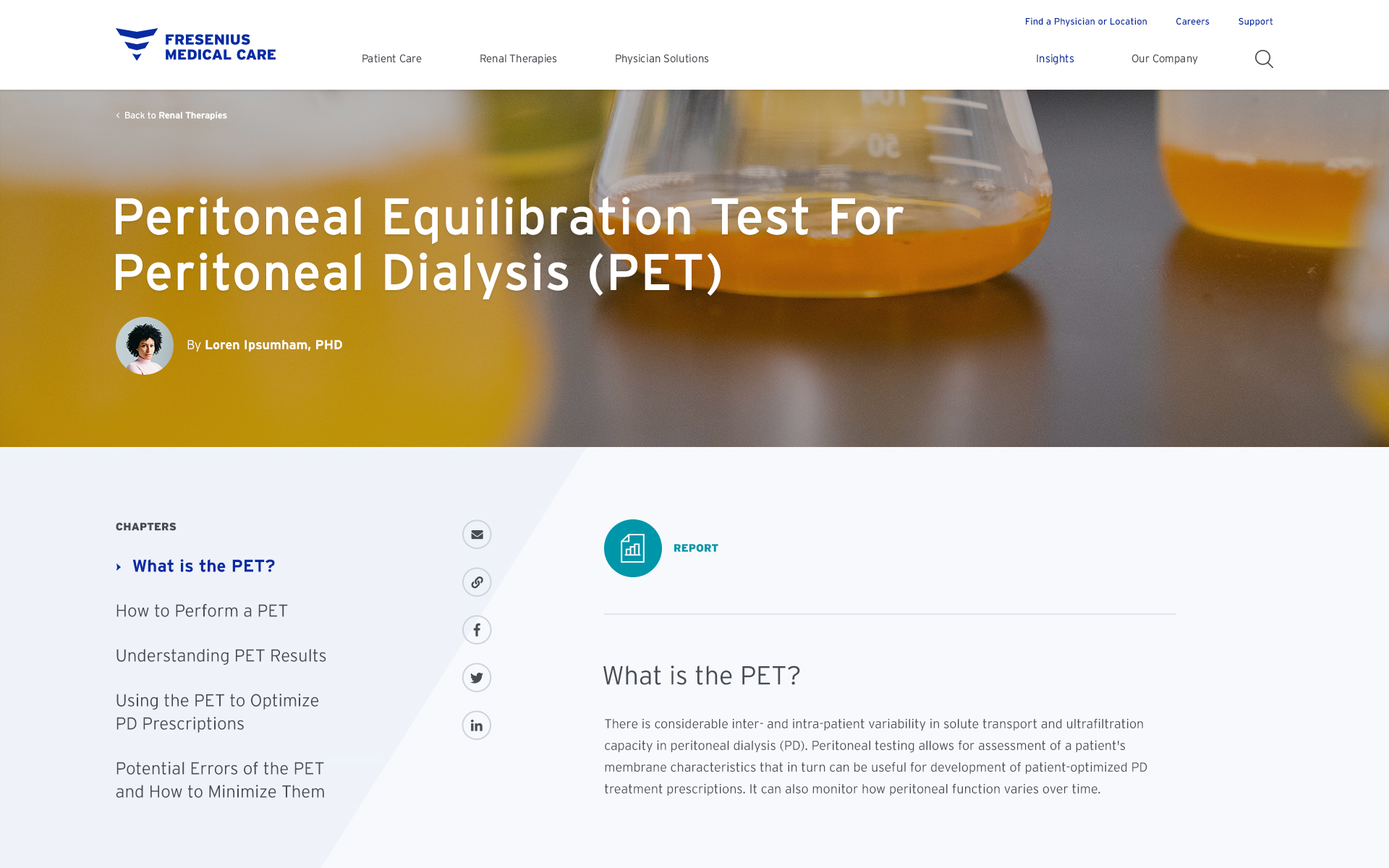
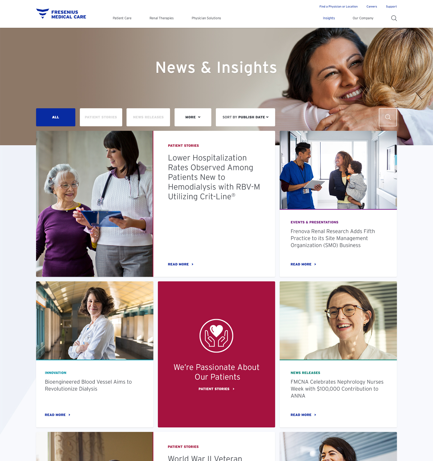
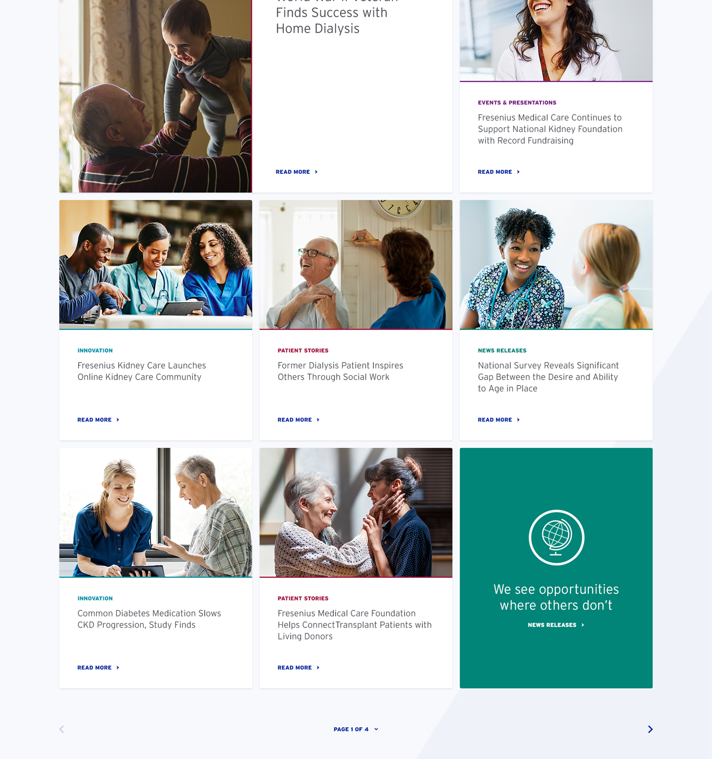
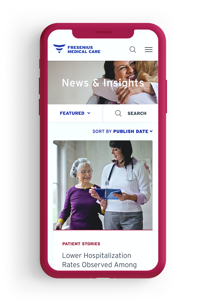
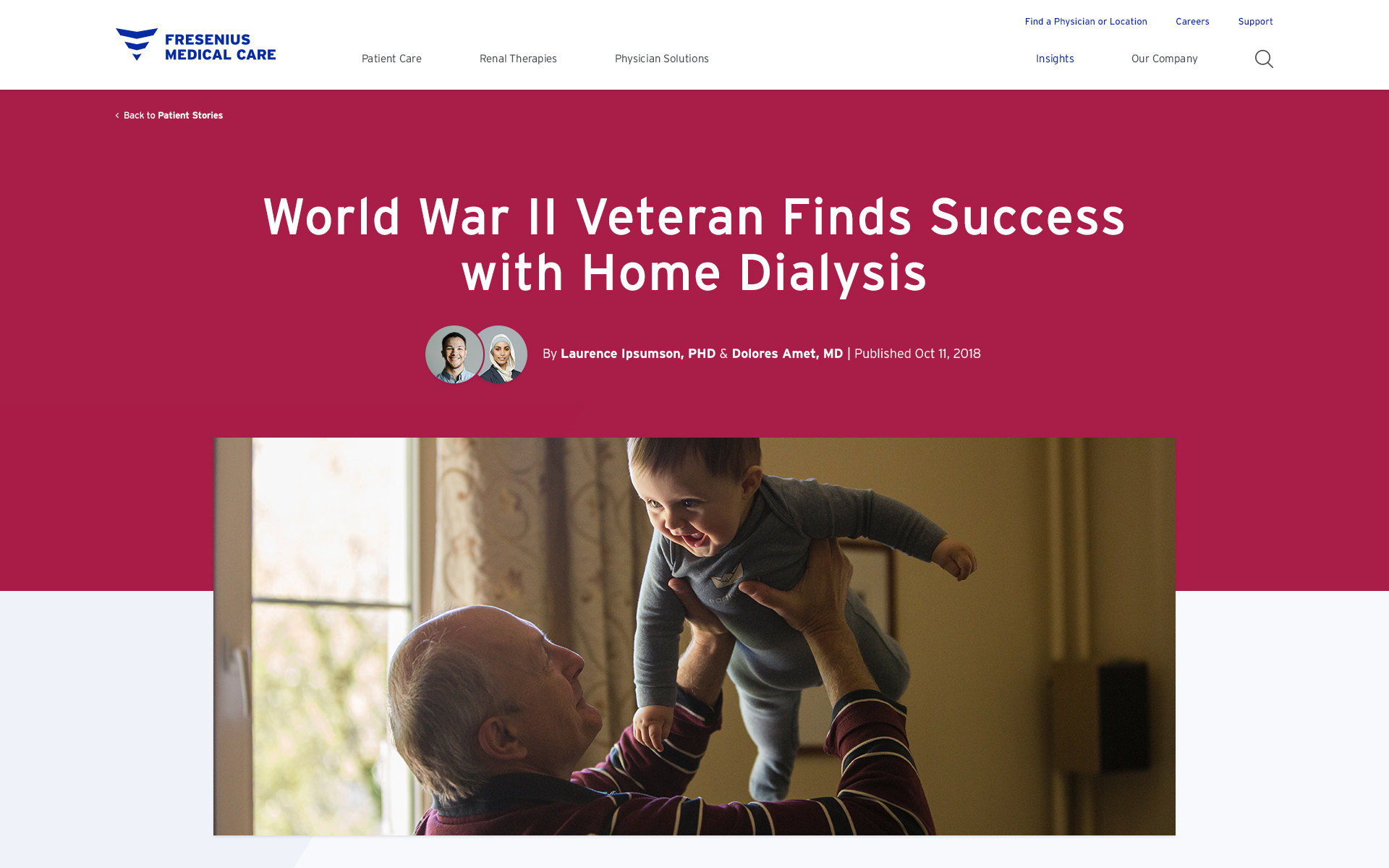
The new FMCNA website positions Fresenius as a thought-leader and trusted partner within the renal (kidney) care industry. We put users first through an interactive homepage that provides quick links to relevant content based on what we already know about them — so patients, health care professionals, and care teams instantly access what they’re looking for. We highlighted Fresenius’s expertise by designing the site as an editorial experience that delivers information through insightful and educational article content that keeps users engaged with the brand. Throughout the site, content is supported by an approachable creative direction that features a refined and intuitive interface, simple and friendly icons (designed by Robert Suta), and vibrant UI flourishes. Through a combination of an intuitive user experience, an editorial approach to content, and a fresh design perspective, Fresenius stands apart in the outdated and clinical landscape of healthcare sites.

Message in a bottle not your style?
Email me @ alinapena95@gmail.com
Prefer to communicate via emojis?
Call or text me @ 917 330 4067
Plz don't steal my swag
Copyright © Alina Peña 2021